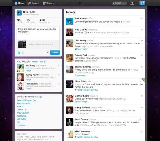
Social networking and micro-blogging site Twitter has undergone a major redesign which now includes Facebook-style brand pages, as well as many new features.
Twitter CEO Dick Costolo and co-founder Jack Dorsey confirmed the radical new redesign, which includes new navigation bars and a host of impressive features that make it easier to connect, at a press conference at its new headquarters in San Francisco yesterday. The new Twitter is available immediately, but will be rolled out across mobile devices in the next few days.
Here’s a run down of the new features:
It’s now easier and faster to see the information. Favourite features can be accessed from the left-hand side and photos, videos and conversations are embedded directly in Tweets so you can see the whole story at a glance. And now everything in Home will appear consistently across computers, iPhones, and Android mobile phones.
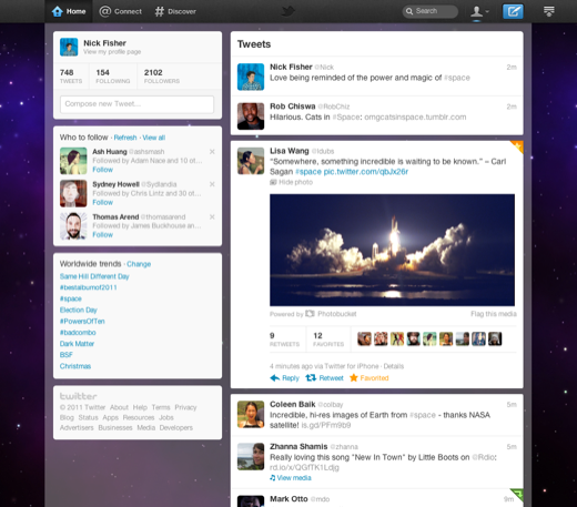
Tweets can now expand to show more information
Connect and flow
The new Connect section is where you get in on the conversation.
It’s the place to see who has followed or mentioned you, retweeted or favorited one of your Tweets.
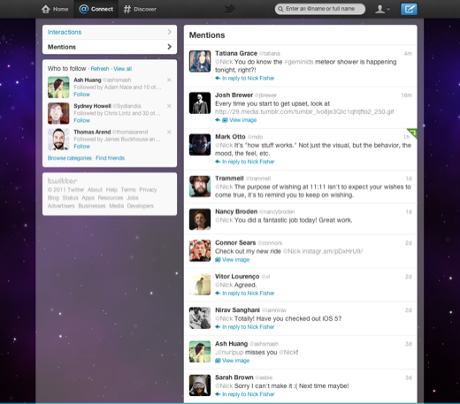
Connect
is your way to keep the conversation flowing
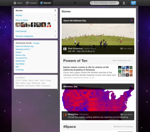
Discover lets you tap into a stream of information, customised just for you.
When you use Discover, you’ll see results reflecting your interests—based on your current location, what you follow and what’s happening in the world. As you use Twitter more, Discover will serve up more related content .
All about you
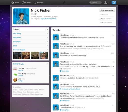
The new profile section puts you and your interests front and center.
Others can Tweet directly to you and view your lists, favourites, followers, photos and more. The Me tab is also where you can stay current on your direct message conversations.
Click on the new Tweet button and instantly send your message out to the world.
No matter where you are within Twitter, it's easy to express yourself. You can upload photos, add your location and link to videos, news stories and more.
The Tweet button lets you share what’s happening right now.
The new Twitter is available immediately and will rollout across mobile devices in the coming days.


