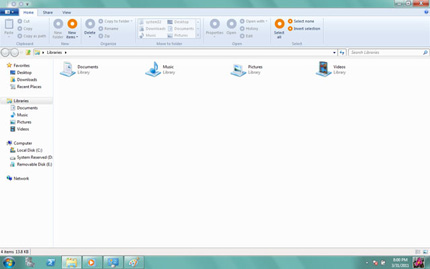
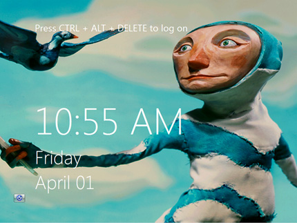
Microsoft is toying with the idea of a refreshed user interface for its next major operating system, Windows 8.
Pre-beta screenshots of Microsoft's software have surfaced on the web, showing one of the operating system's integral components - Windows Explorer - with a ribbon interface in place of the tried-and-trusted toolbar.

The ribbon, previously described by Microsoft as a "modern way to help users find, understand, and use commands efficiently and directly with a minimum number of clicks", is currently employed by the company's Office 2010 software suite and features in a handful of existing Windows 7 applications - including Paint and WordPad.
Consumer reaction to the re-jigged menus has been mixed, but Microsoft looks set to make the ribbon a de-facto standard in the Windows 8 experience.
The screenshots, depicting an early implementation of the tabbed Windows Explorer interface, have also hinted at tight integration with other Microsoft services. Menu options titled "Sync" and "Web Sharing" suggest access to Windows Live Mesh and Windows Live SkyDrive from within the Explorer application, and a new-look Windows 8 welcome screen bears close resemblance to the lock screen featured on Microsoft's mobile platform, Windows Phone 7.


