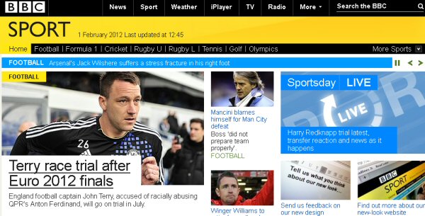
BBC Sport online now sports a much cleaner design which is easier on the eye and more intuitive to navigate and search for content.
Tabs running across the top of the new look site gives users quick access to content on their favourite sports, while the main news now runs down the centre of the page. Feature boxes down the right-hand side provides live scores and radio commentaries, while the left-hand side showcases the showcase news story along with video and audio links, comment and analysis and BBC Sport Tweets.
In a statement revealing the new look, the BBC says that the redesign reflects "the changing needs of sports fans as more and more licence-fee payers go online to get up-to-the-minute updates on the biggest sporting events, as they happen."
The BBC Sport website, which reportedly attracts 11 million visitors per week, plans to provide comprehensive coverage of the London Olympics this summer with 24 lives streams running at any one time.
The redesigned site has launched worldwide today.