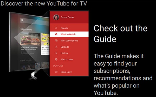
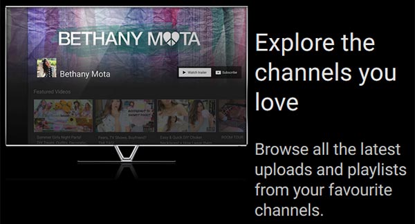
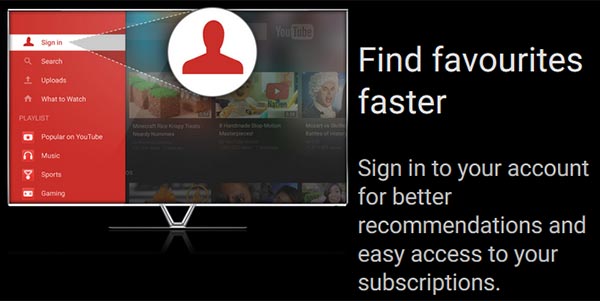
Google has refreshed its YouTube for TV app bringing improved usability, new features and its slick 'material' UI design language. The feature upgrades in particular are welcome and bring the YouTube app for the likes of SmartTVs, set top boxes (STBs) and games consoles much closer in functionality to the computer browser, smartphone and tablet versions.
The focus seems to be upon ease of use and YouTube has produced a video demonstrating this very important quality of the new app, see above.
In the video you can see the interface demonstrated with its slide-in left side navigation and content bar which resembles the YouTube website navigation UI. From the slide in menu options you can quickly explore interesting new content, check out your channel subscriptions, browse through your viewing history and uploads. The new YouTube app also makes YouTube's 'What to watch' menu item rather prominent.

YouTube will still ask you to pair your mobile device and TV so you can use your device as a remote control, but its new features help offer a far better experience whether or not it is paired with your smart device.

The refreshed YouTube app is rolling out first to the Xbox One but should be also on its way to your set top boxes and Smart TVs in the near future. You can have a go with the new interface on your PC if you go to this link – navigate using 'S' to bring up search, 'G' for the guide, 'Esc' to go back and your cursor keys. It works best in a full screen maximised browser window.


