


QTS 4.0
The TS-421 hardware isn't ground breaking, but Qnap is making strides in the software department. The streamlined setup is merely the tip of the iceberg, and the bulk of what's new lies within the revamped QTS 4.0 operating system.
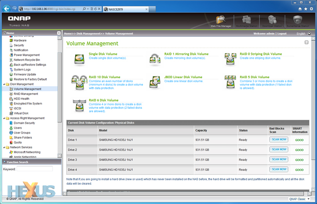
Unfortunately for those wanting to get a taste of the new software, QTS 4.0 is currently only available to new TS-x21 series and TS-x20 series products, and as far as we can tell there's no detailed changelog and no Live Demo, so you can't easily try before you buy.
The above Qnap-provided video demonstration runs through some of the various QTS 4.0 features, and it's clear that the focus has been on improving the user interface. For the record, we didn't have many problems with QTS 3.x, and typically found Qnap's older two-pane interface - menus on the left, controls on the right - familiar and consequently easy to navigate.
Nonetheless, with rivals adopting a more novel approach, Qnap has felt the need to refresh its GUI to make it better suited to touchscreen devices, and, put simply, a whole lot easier on the eye. The end result might not meet the expectations of Qnap enthusiasts who are longing for a new operating system built from the grounds up, but on the face of it Qnap has done enough to breathe new life into the QTS environment.
 |
 |
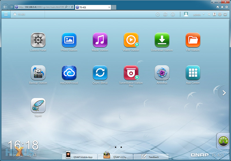
iOS-like Home Screen |
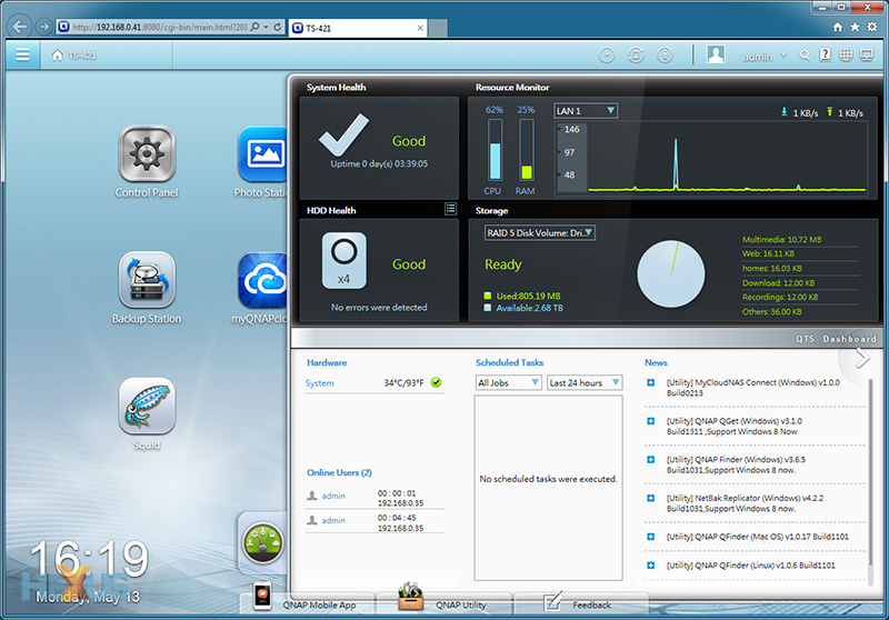
Android-like Widgets |
Designing a new interface for an operating system that offers such a wealth of features is no doubt a challenge, and Qnap may have struggled to find a single design that fits each and every usage scenario. As a consequence, what we have is a user environment that has elements taken from some of the most popular software solutions on the market.
The home screen is right out of the iOS playbook, Android-like widgets are used to display system status information, there's a Windows-like start menu - as well as a well-featured taskbar - and various graphical elements have a Mac OS feel about them.
 |
 |
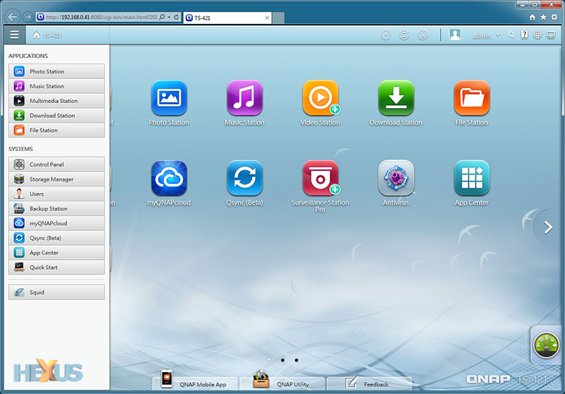
Quick Start Menu |
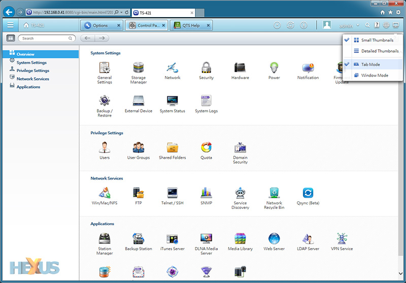
Tabbed or Windowed View |
However, QTS 4.0 isn't always the best of all worlds. With numerous ways of navigating the interface, the environment can at first feel confused and overwhelming. There is a lot going on, and though Qnap has given the user the choice of interacting with the software the way they happen to prefer, the interface can at times feel unnecessarily cluttered.
The feeling of overload can most probably be attributed to the fact that QTS 4.0 continues to offer many of the options available to QTS 3.x, the difference here is that they're presented in prettier tabs or windows, that, while admittedly easy on the eye with attractive transition effects, don't necessarily make it easier to get to certain settings.
We'd like to see Qnap streamline QTS 4.0 and focus on a single navigational experience, however there are elements that are already proving to be mighty useful. Moving with the times, QTS 4.0 now allows users to switch between multiple live windows - making it very easy to configure and use multiple apps simultaneously - and the on-screen notifications for background tasks, external devices and system warnings are well implemented. Also, if you need to get to certain areas of the interface on a regular basis, creating shortcuts on the home screen is as simple as dragging and dropping.


